Designing
Tomorrow,
Today.
dttstudios.com
Choosing a logo to represent my personal brand was both an exciting and challenging task. After much consideration, I decided on the dodecahedron, a geometric shape that embodies the essence of my design philosophy and professional identity. Here's why the dodecahedron stands as a perfect emblem for my brand.
"Design is thinking made visual" - Saul Bass
Symbolizing Creativity and Complexity
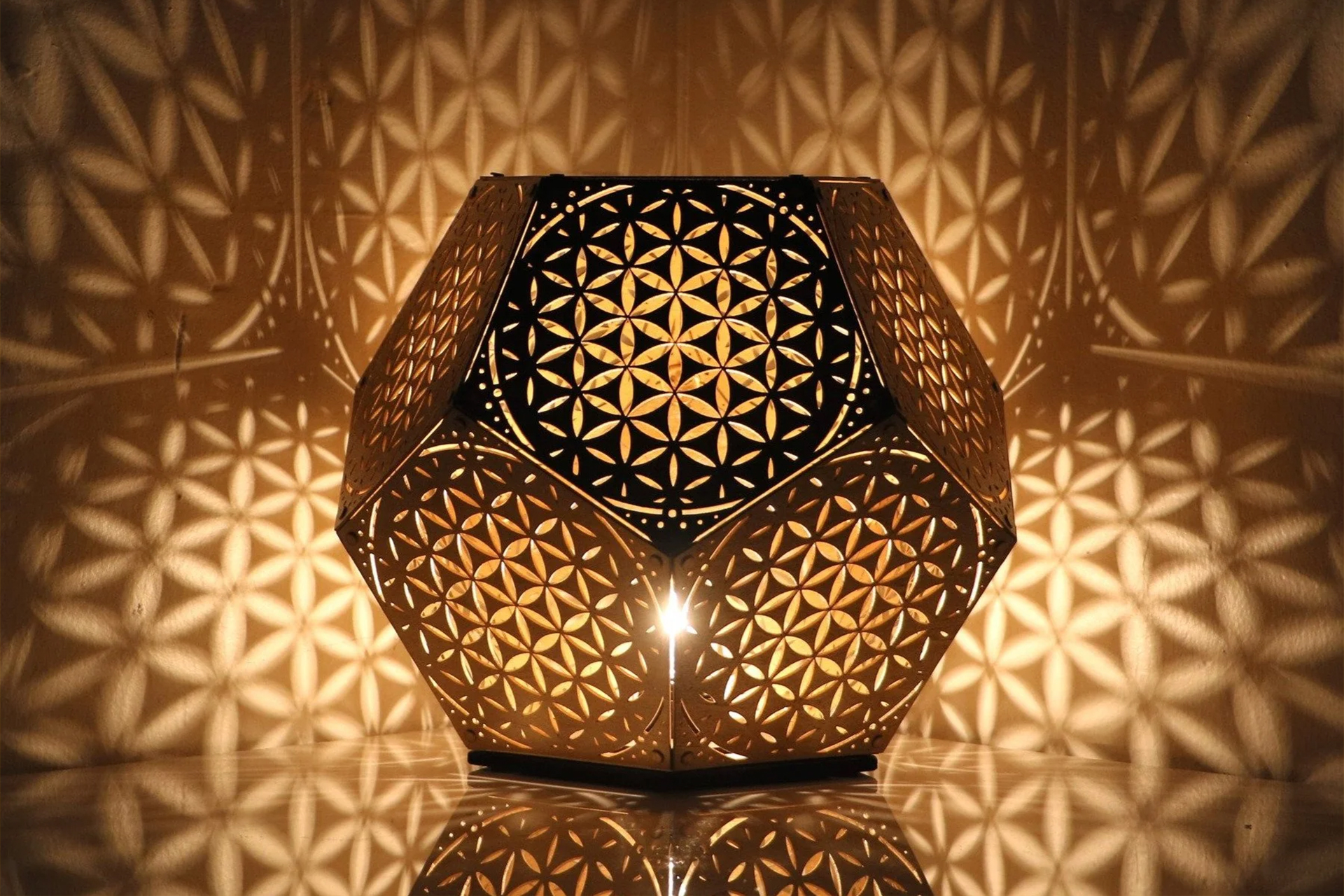
The dodecahedron, with its twelve flat pentagonal faces, is a testament to complexity and creativity. In the world of graphic design, where innovation and the ability to tackle multifaceted projects are paramount, this shape symbolizes my capability to handle intricate tasks with precision and flair. Each face of the dodecahedron can be seen as a facet of my skill set, representing versatility and a wide-ranging expertise in various design domains.
Aesthetic Appeal
Geometric beauty lies at the heart of the dodecahedron. Its symmetrical structure and harmonious proportions are visually striking, capturing attention and leaving a lasting impression. This aesthetic appeal is crucial for a graphic designer's logo, as it not only attracts but also resonates with viewers, conveying a sense of balance and harmony that I strive to achieve in my work.
Association with Platonic Ideals
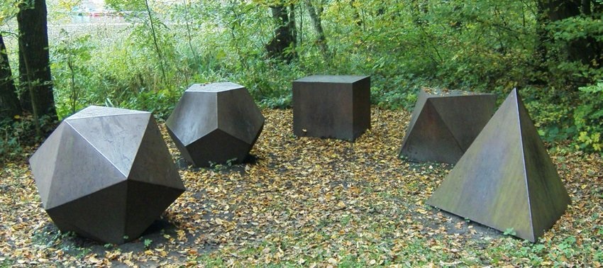
The dodecahedron is one of the five Platonic solids, shapes that have been revered since ancient times for their mathematical perfection and philosophical significance. This connection to classical beauty and intellectual depth suggests that my work is not just about surface aesthetics but also about thoughtful, meaningful design. By choosing a dodecahedron, I align my brand with these timeless ideals of perfection and intellectual rigor.
Symbolic Meanings
Beyond its geometric properties, the dodecahedron carries rich symbolic meanings. It represents wholeness and unity, reflecting my approach to design where every element comes together to form a cohesive whole. Moreover, with twelve faces, it stands for diversity and inclusivity, values that are increasingly important in today's design landscape. It signals my commitment to embracing a wide range of perspectives and ideas in my work.
Modern and Timeless
The dodecahedron strikes a balance between modernity and timelessness. While its roots lie in ancient geometry, its intricate and futuristic appearance suggests innovation and forward-thinking. This duality is crucial for a graphic designer, as it communicates that my designs are both contemporary and enduring, capable of standing the test of time.
Memorable and Unique
In a market flooded with logos, distinctiveness is key. The dodecahedron's unique structure sets it apart from more common geometric shapes, making it more memorable. Its complexity and beauty ensure that it leaves a lasting impression, helping my brand to be recognized and remembered by clients and peers alike.


Customizable and Adaptable
One of the most appealing aspects of the dodecahedron is its flexibility in design. Each of its twelve faces can be customized with different colors, textures, or patterns, allowing me to infuse my personal touch into the logo. This adaptability ensures that the logo can evolve with my brand, staying relevant and reflective of my growth as a designer.
"What a shame," sighed the Dodecahedron. "[Problems are] so very useful. Why, did you know that if a beaver two feet long with a tail a foot and a half long can build a dam twelve feet high and six feet wide in two days, all you would need to build Boulder Dam is a beaver sixty-eight feet long with a fifty-one-foot tail?"
"Where would you find a beaver that big?" grumbled the Humbug as his pencil point snapped.
"I’m sure I don’t know," he replied, "but if you did, you’d certainly know what to do with him."
"That’s absurd," objected Milo (…)
"That may be true," he acknowledged, "but it’s completely accurate, and as long as the answer is right, who cares if the question is wrong? If you want sense, you’ll have to make it yourself."
- Norton Juster, The Phantom Tollbooth
Chapter 14. The Dodecahedron Leads the Way
Conclusion
Choosing a dodecahedron as my logo was a deliberate decision, rooted in its rich symbolism, aesthetic appeal, and flexibility. It encapsulates the essence of my design philosophy – a blend of creativity, complexity, and timeless beauty. Through this logo, I aim to convey my commitment to innovative, inclusive, and meaningful design. The dodecahedron stands as a perfect representation of my brand, reflecting who I am as a graphic designer and the high standards I set for my work.